Quick Answer: To turn research into a conference talk with AI, (1) upload your paper, abstract, or results; (2) the tool builds the standard arc — background, methods, results, discussion — and generates charts from your data; (3) refine and export to PowerPoint, PDF, or Google Slides with speaker notes. Rather than starting from a blank deck two days before your deadline, ChatSlide drafts a presentation-ready talk from your paper in under 2 minutes — free for academics.
Why Research Presentations Take So Long
You have a conference deadline in two days. Your results are solid, your paper is nearly done — but the presentation? That is still a blank slide deck staring back at you.
Research presentations are uniquely demanding. You need to distill months (or years) of work into 15 minutes. Every figure needs context, every claim needs support, and your audience — fellow researchers — will notice when something is off. Unlike a business deck, there is no room for vague bullet points. Your slides need to reflect the rigor of your work.
Most researchers spend 8 to 15 hours building a conference talk from scratch. Between formatting figures, writing speaker notes, and ensuring the narrative flows from background to methodology to results, it consumes time that could go toward actual research.
What Makes Research Presentations Different
Scientific presentations follow conventions that generic slide tools do not understand. A conference talk is not a business pitch. It has a specific structure that audiences expect:
Background and motivation. Why does this problem matter? What gap in the literature are you addressing? Reviewers and audience members want to see you position your work within the existing body of research before diving into methods.
Methodology. Your audience needs enough detail to evaluate your approach. This is where most generic AI tools fail — they either oversimplify technical methods or produce slides crammed with text that nobody can read from the back of a lecture hall.
Results and analysis. Figures, charts, and data visualizations carry the weight here. A good research presentation lets the data speak through clear visuals, not walls of numbers.
Discussion and implications. What do your findings mean for the field? This is where you connect back to the motivation and point toward future work.
Questions and engagement. Strong presenters anticipate questions and prepare backup slides with additional data or alternative analyses.
Building a Conference Talk with ChatSlide
ChatSlide was built to handle the kind of structured, content-heavy presentations that researchers need. Here is how the workflow looks in practice.
Start with Your Research Topic or Paper
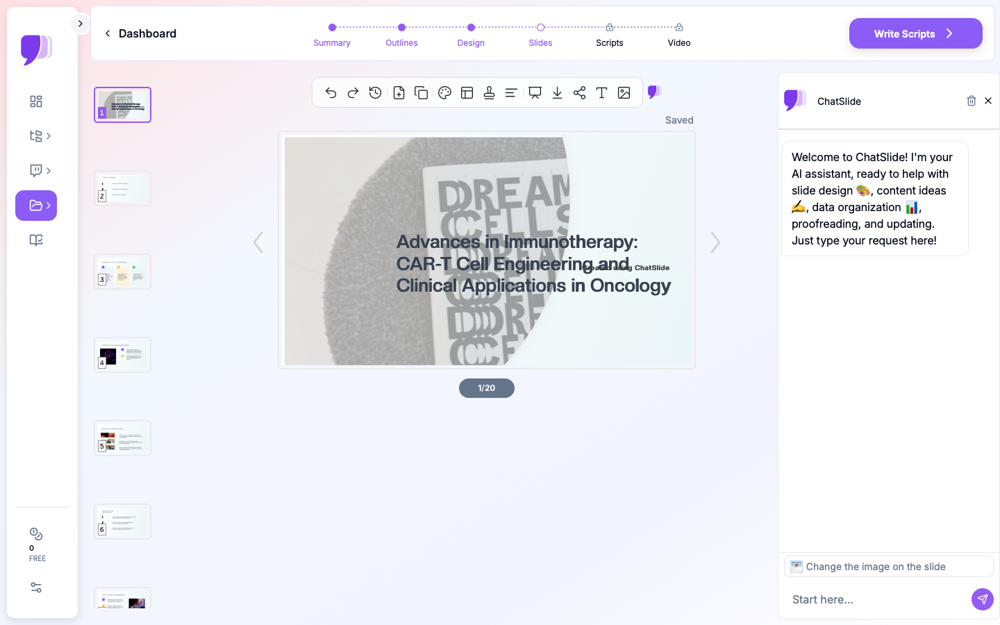
You can begin by entering your research topic directly — for example, "CAR-T cell engineering advances and clinical applications in oncology." ChatSlide uses your topic to generate an outline that follows the standard academic presentation structure.
If you have an existing paper or PDF, you can upload it instead. The AI reads your document and extracts the key sections — introduction, methods, results, discussion — building slides that reflect your actual content rather than generic filler.
Review and Refine the Outline
The generated outline shows your presentation broken into logical sections with subpoints under each. This is where you shape the narrative:
- Reorder sections if your story flows better with results before detailed methodology
- Add or remove subpoints to match your time slot (a 10-minute talk needs fewer sections than a 30-minute invited lecture)
- Adjust the emphasis — maybe your novel methodology deserves more slides than the background
Generate Slides with Relevant Visuals
Once the outline is set, ChatSlide generates full slides with proper formatting. Each slide gets a clear heading, concise text, and stock images that match your subject area. For research talks, the visuals provide context — laboratory settings, molecular structures, clinical environments — without the distraction of generic clip art.
The slides are immediately editable. You can swap in your own figures, adjust text, and rearrange elements. Most researchers use the AI-generated slides as a starting framework, then replace stock images with their actual data figures and charts.
Add Speaker Notes
Each slide can include speaker notes with talking points. For research presentations, this is especially useful for:
- Remembering which specific p-values or confidence intervals to mention
- Noting which backup slides to reference if a particular question comes up
- Keeping track of transition phrases between sections
Tips for Stronger Research Presentations
Beyond the slide-building workflow, here are practices that separate memorable conference talks from forgettable ones.
One Idea Per Slide
The most common mistake in academic presentations is cramming too much onto a single slide. If you need to explain your experimental design AND show your results on the same slide, split it into two. Your audience processes information better when each slide has a single clear message.
Use the "So What?" Test
For every slide, ask: "If an audience member only remembers one thing from this slide, what should it be?" If you cannot answer that in one sentence, the slide is trying to do too much.
Design for the Back Row
Text smaller than 24-point is invisible from the back of most conference rooms. If your methodology section requires dense text, consider using a handout or supplementary document instead of shrinking the font.
Rehearse with a Timer
A 15-minute conference talk with 20 slides gives you roughly 45 seconds per slide. That is less time than most people think. Rehearsing with a timer reveals which sections need trimming and which transitions feel rushed.
Prepare for Questions
Build 3 to 5 backup slides with additional data, alternative analyses, or expanded methodology details. Place them after your conclusion slide. When a question comes up during Q&A, you can jump directly to supporting evidence instead of scrambling to explain verbally.
Common Research Presentation Formats
ChatSlide handles various academic presentation formats that researchers encounter throughout their careers:
Conference talks (10-20 minutes): Focused presentations at academic conferences like ASCO, NeurIPS, or AGU. These demand tight narratives and clear visuals.
Poster presentations: While the format differs from slides, building the content as a presentation first helps organize the narrative before translating it into poster layout.
Lab meetings and journal clubs: Weekly or biweekly presentations where you present your progress or review a recent paper. These are less formal but still benefit from structured slides.
Thesis committee meetings: Progress updates for your advisory committee. These need to balance technical depth with clear communication of milestones and next steps.
Invited lectures and seminars: Longer format (30-60 minutes) presentations where you present a broader view of your research program. These require more background context and a wider narrative arc.
Adapting Your Presentation to Different Audiences
One of the most underrated skills in academic communication is adjusting your presentation for the audience in front of you. The same research requires very different framing depending on who is listening.
Specialist Conference Audiences
When presenting at a focused conference in your subfield, you can assume shared vocabulary and skip basic definitions. Spend less time on background and more time on methodology details and nuanced results. Your audience will have specific, technical questions — prepare backup slides that address alternative statistical approaches, edge cases in your data, or comparisons with closely related work.
Interdisciplinary Conferences
Broader venues require more context. Do not assume the audience knows your field's conventions. Define key terms, explain why your methodology was appropriate (not just what it was), and emphasize the implications of your findings for adjacent fields. ChatSlide's editing tools let you quickly adjust the balance between background and results — ask the AI to expand the motivation section or simplify technical descriptions for a general scientific audience.
Non-Academic Audiences
If you present your research to policymakers, industry partners, or the public, strip out most of the methodology and focus on the "so what." What does this research mean for real-world decisions? Use plain language, concrete examples, and clear visuals. A chart showing patient outcomes matters more to a hospital administrator than a table of p-values.
Handling Figures and Data in Research Slides
Data visualization is where research presentations succeed or fail. A few principles make a significant difference.
One Chart, One Message
Every figure on a slide should make a single point. If your chart shows three different trends, consider splitting it into three slides — one per trend — with a clear heading that states the takeaway. Audiences cannot process a dense multi-panel figure in the 45 seconds you spend on a slide.
Label Everything
Conference projectors vary in quality, and audience members sit at different distances. Make axis labels large enough to read from the back of the room. Include units. Add a brief caption or annotation that states the key finding directly on the slide, so the audience does not have to decode the chart while you are talking.
Use Consistent Color Coding
If your treatment group is blue on slide five, it should be blue on slide twelve. Inconsistent colors force the audience to re-learn your visual language every time a new figure appears. Choose a color palette at the start and apply it throughout.
Replace Tables with Charts When Possible
Tables are useful in papers but difficult to read on slides. If your results table has more than three rows and three columns, consider whether a bar chart or line graph would communicate the same information more effectively. Reserve tables for slides where exact numerical comparisons matter.
Built-In Research Database Access
ChatSlide includes direct integration with PubMed, Google Scholar, and ClinicalTrials.gov (NCT) through its Research tab. Instead of switching between your browser and your slide tool, you can search for papers, import relevant studies, and have the AI incorporate findings and citations directly into your presentation.
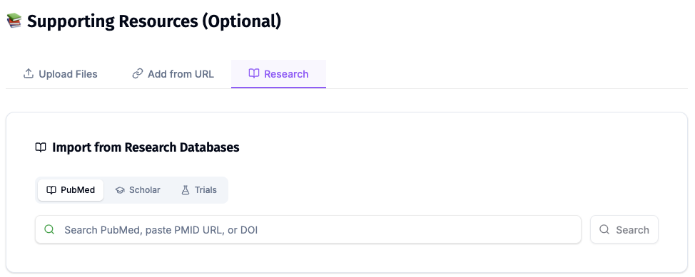
This is particularly valuable when building a literature review section for your conference talk, or when you need to quickly pull in a recently published study that a reviewer or colleague mentioned.
Building a Presentation from a Published Paper
Many researchers need to turn an already-published paper into a conference talk or seminar presentation. This is a different task from building a presentation alongside the research itself.
Upload your paper as a PDF to ChatSlide. The AI identifies the standard sections — abstract, introduction, methods, results, discussion — and generates slides that follow the logical flow of the paper. From there, you make strategic cuts.
A 12-page paper cannot fit into a 15-minute talk. Focus on:
- The single most important finding, not every result
- The methodology choice that most affects interpretation
- The one or two figures that best illustrate your conclusions
- The implications that matter most to this specific audience
Cut everything else. You can always address additional details during Q&A, especially if you have backup slides prepared.
From Hours to Minutes
The traditional approach to building a research presentation — open PowerPoint, stare at a blank slide, spend hours formatting — costs you time that could go toward research. ChatSlide compresses that process by generating a structured, well-formatted starting point that you can refine with your specific data and insights.
Researchers who have used the platform report cutting their preparation time significantly while producing presentations that look more polished than what they typically build manually. The AI handles the formatting and structure; you focus on the science.
Ready to build your next conference talk? Visit ChatSlide to try it with your research topic, or upload your paper directly at app.chatslide.ai.