Quick Answer: To make Google Slides look professional: (1) swap the default font to one of Inter, Poppins, or Source Sans 3, (2) build a 3-color palette (one neutral + one accent + one background) instead of using the template colors, (3) align everything to a 12-column grid, (4) replace stock icons with high-resolution images (Unsplash, Pexels), and (5) leave at least 40% whitespace on every slide. Or skip the design work entirely — ChatSlide regenerates the deck with a professional layout in one click.
Why Most Google Slides Presentations Look Bad
The default Google Slides templates are functional but generic. When everyone starts from the same templates and applies the same default formatting, presentations end up looking nearly identical and unmemorable.
The good news is that you do not need to be a designer to make Google Slides look professional. A few deliberate choices about fonts, colors, layout, and imagery can transform a generic deck into something that looks polished and intentional.
This guide covers the specific design principles that separate amateur-looking slides from professional ones, with practical steps you can apply immediately.
1. Choose the Right Fonts
Fonts have more impact on your slides' appearance than almost any other element. The wrong font choices make everything look cheap, even if your content is excellent.
Use Two Fonts Maximum
Pick one font for headings and one for body text. Using more than two fonts creates visual chaos. Consistency is what makes slides look designed rather than thrown together.
Good Font Pairings for Presentations
- Montserrat + Open Sans — Modern and clean, great for business presentations
- Playfair Display + Lato — Elegant heading with a readable body font
- Poppins + Roboto — Friendly and contemporary, works for most topics
- Oswald + Source Sans Pro — Bold headings with easy-to-read body text
Font Size Guidelines
- Slide titles: 36-44pt
- Body text: 18-24pt
- Labels and captions: 14-16pt
- Minimum readable size from the back of a room: 24pt
If you need to go below 18pt for body text, you probably have too much text on the slide.
Avoid These Font Mistakes
- Do not use Comic Sans, Papyrus, or any "novelty" font in professional settings
- Do not mix serif and sans-serif fonts randomly. If your heading is serif, your body should be sans-serif, or vice versa
- Do not use all caps for body text. Reserve caps for short headings if at all
2. Build a Color Palette
Random color choices are the second biggest reason slides look unprofessional. A consistent color palette ties your entire presentation together.
The 3-Color Rule
Choose three colors and stick to them:
- Primary color — Used for headings, key elements, and accents. This is your brand color or the dominant color of your presentation.
- Secondary color — Used for subheadings, charts, and supporting elements. Should complement the primary color.
- Neutral color — Used for body text and backgrounds. Usually a dark gray (not pure black) or off-white.
How to Pick Colors
- Start with your brand colors if you have them
- Use a color palette generator like coolors.co or color.adobe.com
- Borrow from a photo. If your presentation includes a key image, pull colors from that image for a cohesive look
- When in doubt, go simple. Dark text on a light background with one accent color always works
Applying Colors in Google Slides
- Go to Slide > Edit theme
- Click "Colors" in the toolbar
- Set your custom theme colors so they are available in every color picker throughout the presentation
- This ensures consistency when you or collaborators add new elements
Colors to Avoid
- Neon or overly bright colors as background fills
- Red text on blue backgrounds (or any low-contrast combination)
- More than four colors in a single chart or diagram
- Pure black (#000000) for text. Use a dark gray like #333333 instead — it is easier on the eyes
3. Master Layout and Whitespace
The amount of empty space on your slides matters more than the amount of content. Whitespace is not wasted space. It is what makes your content readable.
The 40% Rule
Aim for roughly 40% of each slide to be empty space. If every slide is packed edge to edge with text, images, and charts, nothing stands out and everything becomes harder to read.
Alignment Is Everything
- Use Google Slides' built-in guides. Go to View > Guides > Show guides. Drag guides to create consistent margins.
- Use Arrange > Align to line up elements. Manually positioned elements almost always look slightly off.
- Maintain consistent margins. Keep the same distance between your content and the slide edges on every slide.
Effective Layout Patterns
- Title + One Visual — A heading on the left with a large image or chart on the right. Simple and effective for most content.
- Three Column — Three equal-width columns for comparing items, showing a process, or listing features.
- Full-Bleed Image — An image that covers the entire slide with text overlaid in a semi-transparent box. Great for section dividers.
- Big Number — A large statistic or data point centered on the slide with context below it. Perfect for impact moments.
Common Layout Mistakes
- Centering everything. Left-aligned text with right-aligned visuals creates a more dynamic and professional look.
- Inconsistent spacing between elements. If you have 20px between your title and subtitle on one slide, keep it at 20px on every slide.
- Putting too many elements on one slide. If you have five bullet points and two images, split it into two slides.
4. Use High-Quality Images
Low-quality images instantly make a presentation look amateur. Blurry, stretched, or watermarked images undermine everything else you do well.
Where to Find Good Free Images
- Unsplash (unsplash.com) — High-resolution photos, free for commercial use
- Pexels (pexels.com) — Similar to Unsplash with a slightly different library
- Icons8 (icons8.com) — Icons, illustrations, and photos
- Google Slides built-in search — Insert > Image > Search the web (results vary in quality)
Image Sizing Rules
- Never stretch an image disproportionately. Hold Shift while dragging corners to maintain the aspect ratio.
- Use images that are at least 1920x1080 pixels for full-slide backgrounds.
- Crop images to focus on the relevant part rather than shrinking the whole image to fit.
Using Images Effectively
- One hero image per slide is better than three small images
- Use consistent image styles. If some images are photos and others are illustrations, it looks disjointed. Pick one style.
- Apply a slight shadow or rounded corners for images placed on solid backgrounds. This adds depth without being distracting.
- Use the same aspect ratio for all images in a series (like team photos or product shots)
5. Simplify Your Text
The number one design problem in presentations is too much text. Slides are not documents. They are visual aids.
The 6x6 Guideline
No more than six bullet points per slide, and no more than six words per bullet point. This is a guideline, not a rigid rule, but it pushes you in the right direction.
Better Approaches to Text
- Use headlines, not sentences. Write "Revenue up 23% in Q3" instead of "Our revenue increased by 23% during the third quarter of this year."
- Break long lists across multiple slides. Five slides with two points each are more effective than one slide with ten points.
- Let the presenter add context. The slides should support your talking points, not replace them.
Formatting Text for Readability
- Use line spacing of 1.25 to 1.5 for body text
- Left-align body text (centered text is harder to read in paragraphs)
- Use bold for emphasis instead of underline or italics
- Create visual hierarchy with font size differences of at least 8pt between heading and body
6. Use Consistent Icons and Graphics
Icons add visual interest and help communicate ideas quickly. But inconsistent icon styles are worse than no icons at all.
Finding Consistent Icon Sets
- Flaticon (flaticon.com) — Large library with matching icon packs
- The Noun Project (thenounproject.com) — Simple, clean icons
- Material Icons (fonts.google.com/icons) — Google's own icon library
Icon Style Rules
- Use icons from the same set or at least the same visual style (all outline, all filled, or all flat)
- Keep all icons the same size on a given slide
- Use your accent color to tint icons so they match your palette
- Do not mix clipart-style graphics with modern flat icons
7. Add Visual Hierarchy
Visual hierarchy guides your audience's eyes to the most important information first. Without it, people do not know where to look.
How to Create Hierarchy
- Size: Make the most important element the largest
- Color: Use your accent color to highlight key information
- Position: Place the most important element at the top-left (where eyes naturally start in left-to-right languages)
- Contrast: Dark text on a light card, or light text on a dark background for call-out boxes
Example: Data Slide
Instead of presenting a table with eight rows of equal formatting:
- Pull out the most important number and display it large (48pt+) at the top
- Add a one-line context sentence below it (20pt)
- Place the supporting data in a smaller table or chart below (14-16pt)
This makes the key insight immediately obvious and the supporting data available for anyone who wants to dig deeper.
8. Leverage Slide Transitions Wisely
Transitions and animations can enhance your presentation or destroy it. The key is restraint.
What Works
- Fade between slides for a smooth, professional feel
- Appear animation for revealing bullet points one at a time during a presentation
- Dissolve for image transitions
What to Avoid
- Spin, bounce, fly-in, or any "playful" transition in professional settings
- Different transitions on every slide. Pick one and use it consistently.
- Animations on every element. Animate strategically — only when revealing information sequentially adds to understanding.
9. Create a Master Slide Template
The most efficient way to maintain consistency is to build a master slide template before you start adding content.
Setting Up Your Template
- Go to Slide > Edit theme in Google Slides
- Modify the Master slide with your chosen fonts, colors, and logo placement
- Create layouts for common slide types: title, content, two-column, section divider, image-focused
- Apply consistent margins, font sizes, and color usage across all layouts
- Save the presentation as your template and duplicate it for future decks
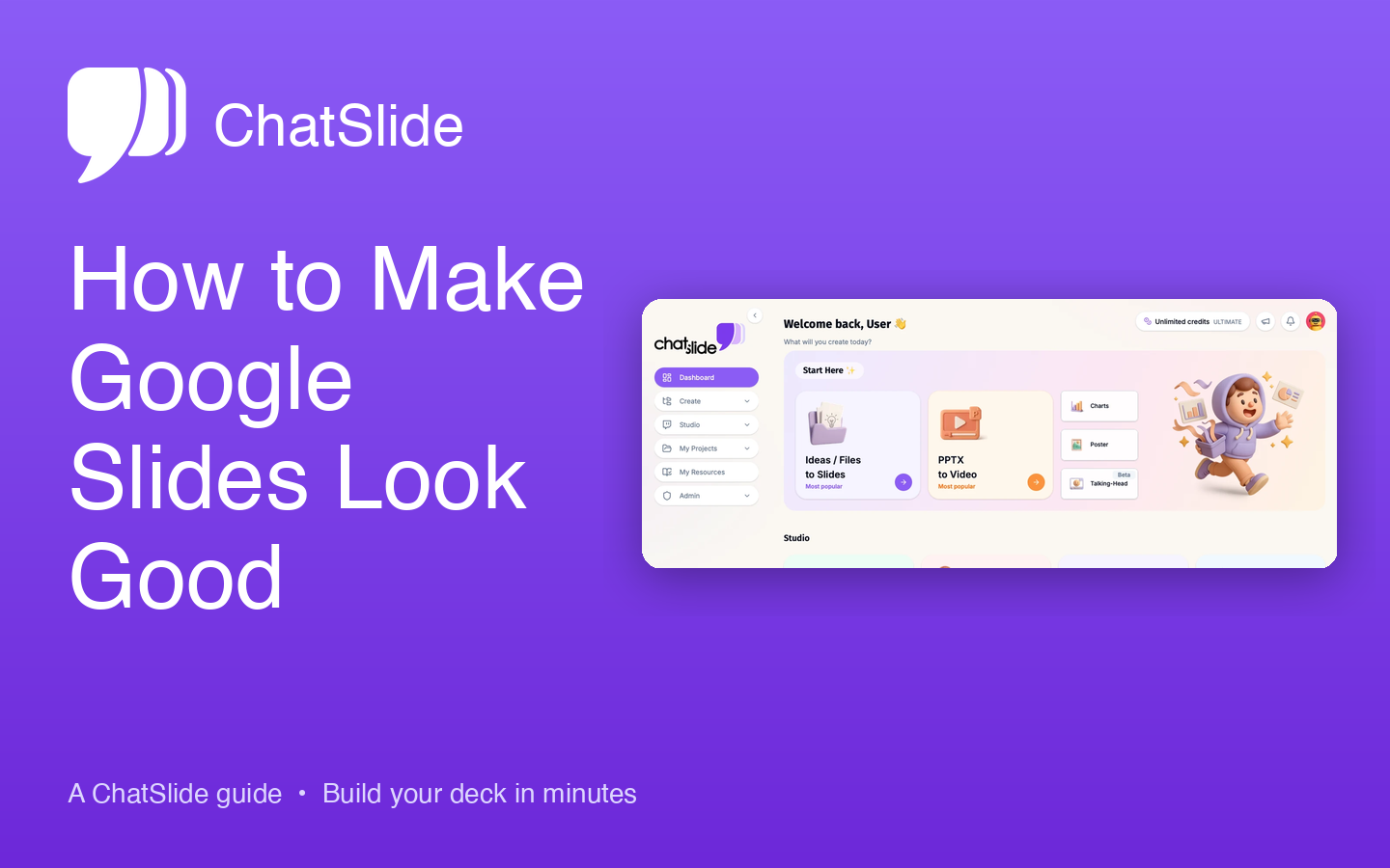
Skip the Design Work Entirely
If you want professional-looking slides without spending time on fonts, colors, layouts, and image sourcing, AI tools can handle the design for you.
ChatSlide AI generates polished presentations from your content automatically. Upload a document, paste text, or describe your topic, and the AI creates slides with professional layouts, consistent typography, and properly formatted visuals. The design principles in this guide are built into the AI, so every slide follows them without manual effort.
This is especially useful for people who create presentations frequently and want consistent quality without repeating the design process each time.
Quick Checklist Before You Present
Use this checklist to review your slides before presenting:
- [ ] Maximum two fonts used throughout
- [ ] Three-color palette applied consistently
- [ ] At least 40% whitespace on each slide
- [ ] All elements aligned (use Arrange > Align)
- [ ] Images are high resolution and consistently styled
- [ ] No slide has more than six bullet points
- [ ] Font sizes are readable from the back of the room (24pt minimum)
- [ ] Transitions are subtle and consistent
- [ ] Spelling and grammar checked
Summary
Making Google Slides look professional comes down to deliberate choices about fonts, colors, spacing, and imagery. You do not need design skills. You need consistency and restraint.
Start with two fonts, three colors, and generous whitespace. Use high-quality images from free stock sites. Simplify your text to headlines and key points. Align everything precisely. These changes take minutes to implement but make your presentations look significantly more polished.
Build a master template once and reuse it for every presentation. The upfront investment saves hours of design work over time and ensures every deck you create meets a consistent quality bar.