Quick Answer: The best alternatives to bullet points are: (1) one idea per slide as a single headline, (2) a big number with context, (3) an icon + label grid instead of a list, (4) a chart that shows the point, (5) a process flow or timeline, (6) a comparison table or two-column layout, (7) a full-bleed image with one caption, (8) a diagram of relationships, (9) progressive reveal (split a list into sequential slides), and (10) a quote slide. The underlying fix is to turn each bullet into a visual that shows the idea. An AI tool like ChatSlide does this automatically — it lays out your content as charts, grids, and visuals instead of a wall of bullets.
Why Bullet Points Fail
"Death by bullet point" is a cliché because it is true. In a widely shared r/powerpoint thread distilling five years of slide research (63 comments), the consensus was blunt: bulleted text walls are where attention goes to die.
The reason is cognitive. When a slide is full of text and you also talk, your audience tries to read and listen at once — and does neither well. This is the "redundancy effect": identical information in two channels competes instead of reinforcing. Bullets also flatten meaning. A list of five equal-weight points tells the audience nothing about what matters most, how the points relate, or what to do with them.
Slides are visual aids, not teleprompters. The alternatives below replace lists with layouts that actually communicate. You do not have to abandon bullets entirely — but most of the time, something else lands harder.
1. One Idea Per Slide (The Single Headline)
The simplest fix: put one clear statement on the slide, large, and say the rest out loud. Instead of five bullets about a product launch, make five slides, each with one headline — "We shipped three weeks early," "Adoption hit 40% in week one," and so on.
This forces you to decide what each slide is for. It also makes the deck scannable and memorable. Headlines, not sentences: "Revenue up 23% in Q3," not a paragraph explaining it.
2. The Big Number
When a single statistic carries the message, show it at full size. One number at 96pt, a one-line label beneath it, nothing else. "$2.4M — saved in the first year." A big number creates an impact moment that a bullet buried in a list never will.
Use it for headline metrics, milestones, and the one stat you want people to remember.
3. Icon + Label Grid
A list of features or benefits almost always reads better as a grid. Three to six cells, each with a simple icon and a two-or-three-word label. The eye takes in a grid at a glance; it has to grind through a list line by line.
Keep the icons from one consistent set and one color so the grid looks designed, not assembled. This is the single most reusable replacement for a "here are our N things" bullet slide.
4. A Chart That Shows the Point
If your bullets are describing numbers — trends, comparisons, breakdowns — delete the words and draw the chart. A line going up says "growth" faster than a bullet that says "revenue grew." Give the chart a takeaway title and highlight the one bar or point that matters; grey down the rest.
This is where the right tool earns its keep: charts built from your real data beat both bullet lists and generic stock chart images.
5. Process Flow or Timeline
Bullets describing steps or a sequence of events should be a flow. Boxes connected by arrows for a process; a horizontal timeline for events over time. The shape itself communicates "these happen in order," which a vertical list only implies.
Great for onboarding steps, project phases, roadmaps, and any "first, then, finally" content.
6. Comparison Table or Two-Column Layout
When you are contrasting options — before vs. after, us vs. them, plan A vs. plan B — a two-column layout or a small table makes the contrast instant. Bullets describing differences make the audience hold both lists in their head and compare manually. A table does the comparison for them.
7. Full-Bleed Image With One Caption
For emotional or contextual moments, let a single high-quality image fill the slide with one short line of text over it. A photo of the customer, the product in use, the place — paired with one caption — carries more than a bulleted description of the same thing. Use this for section dividers and storytelling beats.
8. A Diagram of Relationships
If your bullets are really describing how things connect — a system, an org, a set of forces — draw the relationship. A simple diagram (hub and spokes, a cycle, a layered stack, a 2x2 matrix) shows structure that a list cannot. The classic 2x2 is a consulting staple precisely because it turns four bullet points into one clear picture.
9. Progressive Reveal (Split the List)
Sometimes you genuinely have a list — but you do not have to show it all at once. Break it across slides or reveal items one at a time as you speak. Each item gets its own moment instead of competing with the others. The audience stays with you instead of reading ahead to the last bullet.
This keeps the "list" structure when it is truly needed, without the wall-of-text problem.
10. The Quote Slide
To make a point with authority, show the actual quote — from a customer, an expert, a study — large and clean, with attribution. One quote, centered, lots of white space. It is more credible and more memorable than paraphrasing the point into a bullet.
When Bullet Points Are Actually Fine
Bullets are not banned. They are the right tool for:
- Leave-behind documents and reference decks people read on their own, where no speaker competes with the text.
- Short, genuinely parallel lists of three or four items — an agenda, a quick checklist.
- Appendix slides that exist to be looked up, not presented.
The rule of thumb: if you will speak over the slide, replace the bullets. If people will read the slide alone, a clean short list is okay.
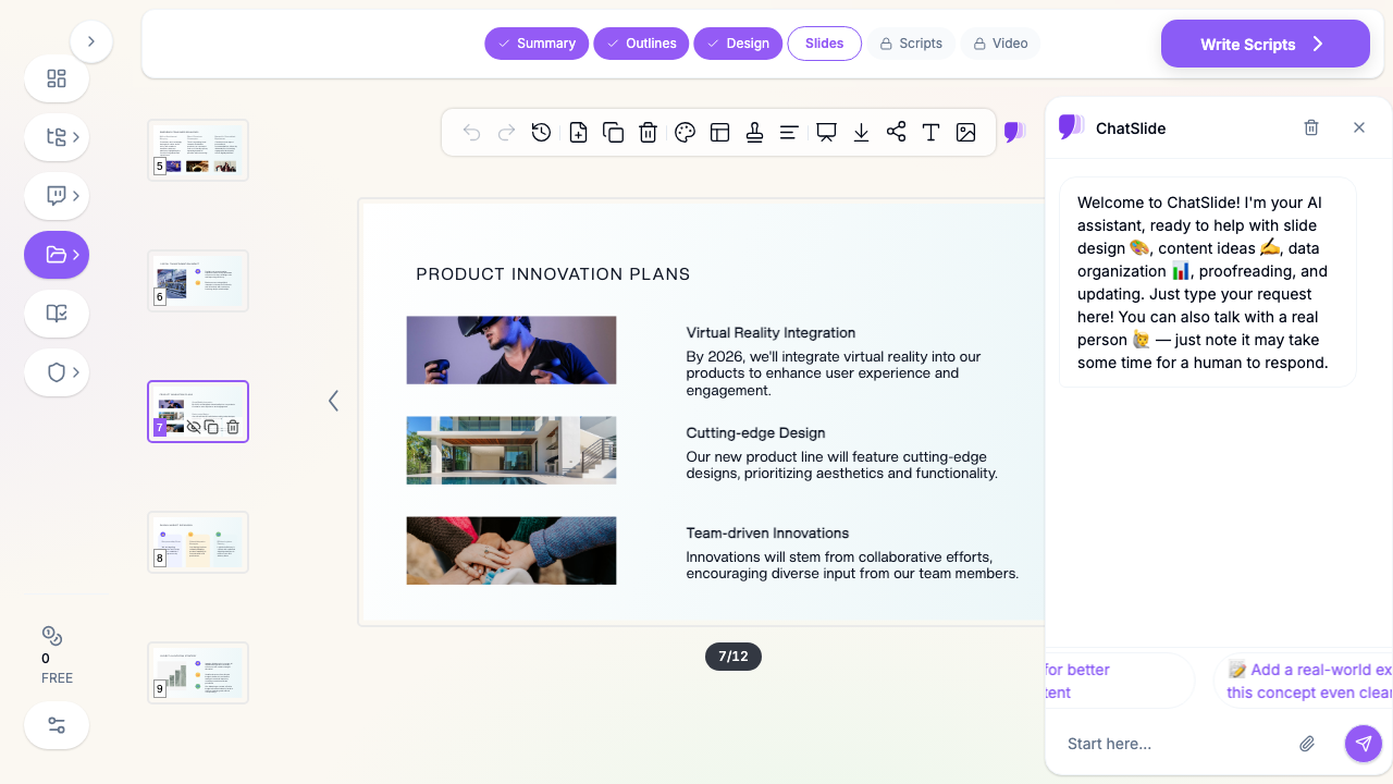
Let AI Do the Layout
Turning every bullet into the right visual — a grid here, a chart there, a flow on the next slide — is a lot of manual design work. That friction is exactly why people fall back on bullets: they are fast to type.
ChatSlide AI removes the friction. Give it your content — notes, a document, a data set, or a topic — and it generates slides that default to visual layouts: icon grids, real charts from your numbers, process flows, and image-led slides, with one idea per slide. Instead of a deck full of lists, you get a deck full of visuals, and you can refine any slide with targeted AI edits. When a short bulleted list genuinely is the right call, it uses one — but it will not turn your whole presentation into death by bullet point.
Summary
Bullet points fail because they make audiences read and listen at once, and because they flatten every idea to the same weight. Replace them by showing the point instead: one headline per slide, big numbers, icon grids, charts, flows, comparisons, full-bleed images, diagrams, progressive reveals, and quotes. Keep bullets only for documents meant to be read alone or short parallel lists. And when the manual design is the obstacle, an AI deck maker like ChatSlide builds the visual version for you — so escaping bullet hell takes a click, not an afternoon.