Quick Answer: A QI project deck for a quality committee follows the SQUIRE 2.0 structure plus an A3 visual: (1) Problem statement + aim (SMART goal with target % and date), (2) Baseline data — run chart with median + special-cause flags, (3) Root cause analysis — fishbone or 5 Whys, (4) PDSA cycle table (cycle, intervention, prediction, result), (5) Outcome run chart showing pre/post shift, (6) Sustainability plan + spread. Target 10–15 slides for 15 minutes. ChatSlide generates Chart.js run/control charts from your monthly data and auto-builds the fishbone diagram from your cause categories.
The Quality Improvement Presentation Problem
Quality improvement (QI) work generates dense artifacts — PDSA cycles, run charts, control charts, fishbone diagrams, A3 reports, value stream maps — and almost none of it slides cleanly into a presentation. A clinical QI lead finishes a six-month sepsis bundle compliance project with three completed PDSA cycles, two interventions, and 18 months of monthly run-chart data. Now they need a 15-minute deck for the quality committee.
The slides take longer than the project documentation did. Run charts get screenshotted from Excel and pasted at the wrong aspect ratio. The fishbone diagram from a brainstorming whiteboard never makes it into a clean digital version. The PDSA storyboard, which the team understands intuitively, takes three iterations to make legible to a leadership audience that has never seen the model for improvement.
Healthcare QI leaders, Lean Six Sigma Black Belts, manufacturing process engineers, and operations managers all hit the same wall. The methodology — Plan-Do-Study-Act, DMAIC, A3 thinking, root cause analysis — is rigorous. The presentation that communicates it is usually not.
What Makes a Strong QI Presentation
The best quality improvement presentations share several qualities that generic project slides lack:
A clear problem statement with a SMART aim. Quality committees and Lean steering teams want to know what problem you're solving, how you're measuring success, and what your target is. Vague aims like "improve patient flow" don't survive a leadership review. Strong aims read like "reduce ED door-to-provider time from 42 minutes to under 30 minutes by Q4 2026."

Process visualization that matches the methodology. PDSA cycles need a visible cycle structure, not bullet points. Fishbone diagrams need to look like fishbones, not lists. Process maps need swim lanes. SIPOC diagrams need the standard layout. Reviewers who have done QI work expect these visual conventions and skim past slides that ignore them.
Run charts and control charts with annotations. A run chart without annotations showing when the intervention started is a chart of noise. Control charts need centerlines, control limits, and clear marking of special cause variation. The visual itself should make the impact obvious before anyone reads the supporting text.
Honest reporting of failed PDSA cycles. The first PDSA cycle rarely works. Strong QI presentations show the failed adapt-or-abandon decisions — that's where the learning happened. Hiding failed cycles makes the project look superficial; showing them makes it look rigorous.
A clear sustainment plan. Leadership reviewers always ask: "How do you keep this from regressing once you stop watching?" Slides need to address ownership, monitoring frequency, escalation thresholds, and integration into standard work.
Step-by-Step: Building a QI Presentation with ChatSlide
1. Frame the Project with Specificity
Start your topic prompt with the actual aim statement, the methodology, and the audience. Generic "quality improvement presentation" produces generic content. Specific framing produces relevant slides.
Examples of strong topic prompts:
- Healthcare QI: "PDSA quality improvement project to reduce 30-day heart failure readmissions on a 28-bed cardiology unit, presenting three completed cycles and a control chart of monthly readmission rates"
- Lean Six Sigma: "DMAIC project on order-to-cash cycle time reduction in a mid-sized manufacturer — Define, Measure, Analyze, Improve, Control phases with process capability data and a sustainment plan"
- Operational excellence: "Root cause analysis of recurring downtime on Line 3 packaging equipment using fishbone diagram, 5 Whys, and Pareto analysis, with an A3 storyboard for plant leadership"
The audience field shapes vocabulary. A presentation for a hospital quality committee uses different language than one for a CMS site visit or a Joint Commission survey readiness review.
2. Choose the Right Scenario Type
For quality improvement project presentations, the Education > Lecture scenario produces the structured, methodology-driven sections QI work requires. For shorter executive briefings or A3 storyboards, the General scenario allows tighter, summary-style layouts.
Set section count to 6-8 to cover the full methodology arc:
- Background and problem statement
- Aim statement and measures (outcome, process, balancing)
- Baseline data and root cause analysis
- Interventions and PDSA cycles
- Results with run/control charts
- Sustainment and spread plan
3. Refine the Generated Outline
The AI generates a methodology-aware outline. For a PDSA project, you'll see sections for each cycle with Plan, Do, Study, Act subpoints. For a DMAIC project, you'll see the five-phase structure with appropriate sub-deliverables (project charter in Define, measurement system analysis in Measure, root cause hypotheses in Analyze, and so on).
Review the outline for methodology fidelity. Does the Define phase include voice of the customer? Does the Analyze phase distinguish between common and special cause variation? Does the Control phase include a response plan?
4. Add Visual Anchors
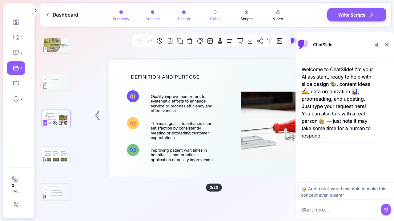
QI presentations need diagrams that look like the methodology, not bullet lists pretending to be diagrams. ChatSlide's structured layouts accommodate the cycle, matrix, and process visualizations that QI work depends on. For the data-heavy slides — run charts, Pareto charts, control charts — you can paste your actual chart images during editing.
Stock imagery should match the operational context. A healthcare QI presentation benefits from clinical environment photography. A manufacturing presentation benefits from production floor imagery. Generic office stock photos undercut the credibility of operational improvement work.
5. Customize for Audience and Format
QI presentations get reused across different audiences with different time budgets:
- 5-minute huddle update: Aim statement, current run chart, next PDSA cycle. Three slides.
- 15-minute committee presentation: Background, methodology, results, sustainment. Eight to twelve slides.
- 30-minute deep dive: Full methodology walkthrough, all PDSA cycles including failed adapts, statistical analysis, spread plan. Twenty-plus slides.
- Conference poster or oral abstract: IHI, ASQ, IISE, or specialty society format with structured abstract sections.
Generate the longest version first, then duplicate and trim for shorter formats. Reuse the data visualizations across all versions.
Common QI Presentation Formats
The Model for Improvement (PDSA) Format
Used by IHI, hospital quality departments, and primary care improvement collaboratives:
- Aim statement (what, by when, by how much, for whom)
- Measures (outcome, process, balancing)
- Changes (the change ideas you tested)
- PDSA cycles (Plan, Do, Study, Act for each iteration)
- Annotated run chart showing the impact of each cycle
- Spread and sustainment
This is the most common format in healthcare quality improvement and works well for projects with multiple iterative tests.
The DMAIC Format
Used in Lean Six Sigma Green Belt and Black Belt projects:
- Define: Project charter, SIPOC, voice of customer, problem statement
- Measure: Operational definitions, measurement system analysis, baseline performance
- Analyze: Root cause analysis, hypothesis testing, Pareto, fishbone
- Improve: Solution selection, pilot results, implementation plan
- Control: Control plan, response plan, sustainment metrics
This format is expected in formal Lean Six Sigma certification deliverables and is the default for many manufacturing and service organizations.
The A3 Format
A single-page storyboard that fits on an A3-sized sheet (or one slide), originally from Toyota Production System:
- Background and current condition
- Goal and target state
- Root cause analysis
- Countermeasures
- Implementation plan
- Follow-up and sustainment
The A3 forces brevity and visual thinking. Strong A3s use diagrams and charts more than bullet text. ChatSlide can generate a multi-slide A3 walkthrough that you can compress into a single layout for printing.
The Root Cause Analysis (RCA) Format
Used after sentinel events, near-misses, and recurring failures:
- Event description and timeline
- Cause-and-effect analysis (fishbone or fault tree)
- Contributing factors (human, environmental, process, equipment)
- 5 Whys progression
- Corrective and preventive actions
- Effectiveness measures and follow-up plan
RCA presentations require careful tone — they're often presented to leadership after harm events or significant failures, and the focus must stay on system factors, not individual blame.
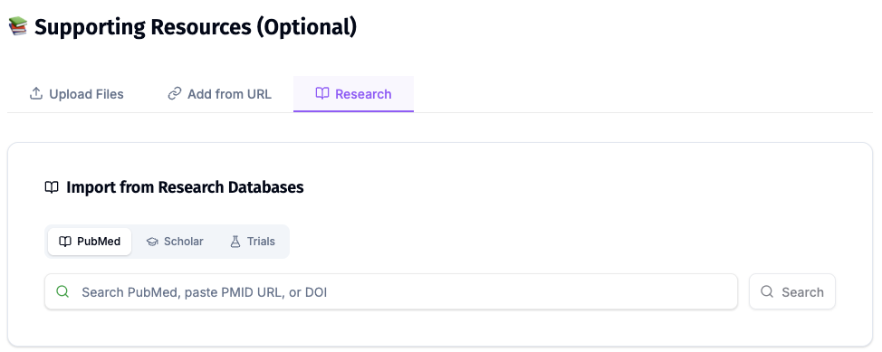
Direct Research Database Access
ChatSlide's Research tab connects to the databases physicians use daily:
- PubMed: Search by keyword, PMID, or DOI. Find the landmark trials, recent publications, and clinical guidelines relevant to your case. The AI reads abstracts and incorporates key findings into your slides with citations.
- Google Scholar: When your topic spans disciplines — say, the intersection of genetics and oncology — Scholar captures the broader academic literature that PubMed alone might miss.
- Clinical Trials (NCT): Presenting on a treatment where pivotal trials are ongoing? Search by NCT number or condition to pull trial design, endpoints, and status into your slides.
Tips for Quality Improvement Presentations
Lead with the chart, not the bullet list. When you have an annotated run chart that shows pre-intervention baseline, intervention point, and post-intervention shift, that single image tells the story better than three slides of explanation. Make it the largest element on the slide.
Use the methodology vocabulary precisely. Conflating "common cause" and "special cause" variation, or treating PDSA as a synonym for "trial and error," signals to expert reviewers that the methodology was applied loosely. Consistent, correct vocabulary builds credibility.
Show the failed cycles. A presentation with three successful PDSA cycles and zero failed adapts looks suspicious to anyone who has done QI work. Including a failed cycle with a clear "what we learned and what we tried next" makes the project look honest and rigorous.
Tie outcome measures to balancing measures. If your aim is to reduce length of stay, show that readmission rates didn't increase as a result. Leadership reviewers always ask about unintended consequences — answer the question before they ask it.
Address sustainment explicitly. Reviewers will ask: "Who owns this measure now? How often is it reviewed? What's the threshold for re-engaging the QI team?" Have a slide that answers all three questions.
Match the format to the audience's QI maturity. A leadership team familiar with Lean Six Sigma will want to see DMAIC structure and statistical analysis. A clinical committee unfamiliar with control charts may need run charts with simpler annotations. Mismatch creates either confusion or condescension.
Get Started with QI Presentations in ChatSlide
Quality improvement work deserves presentations that match its methodological rigor. ChatSlide generates structured QI decks — PDSA storyboards, DMAIC walkthroughs, A3 reports, and RCA presentations — from a topic description and audience definition. The methodology stays intact; the slide-building work disappears.
Start with ChatSlide and turn your next QI project into a presentation that does the work justice. Free tier includes enough credits to generate a full project presentation and refine it before any committee review.
A note on patient data and HIPAA. ChatSlide's standard plans are not a HIPAA-covered service — keep PHI out of slide content, prompts, and uploads. For hospital systems, group practices, and clinics that need a Business Associate Agreement, our Enterprise plan offers HIPAA-compliant deployment options — contact us to discuss BAA terms, SSO, and private-cloud or on-prem hosting.